written by Valerie Hesse and Jessie Smith
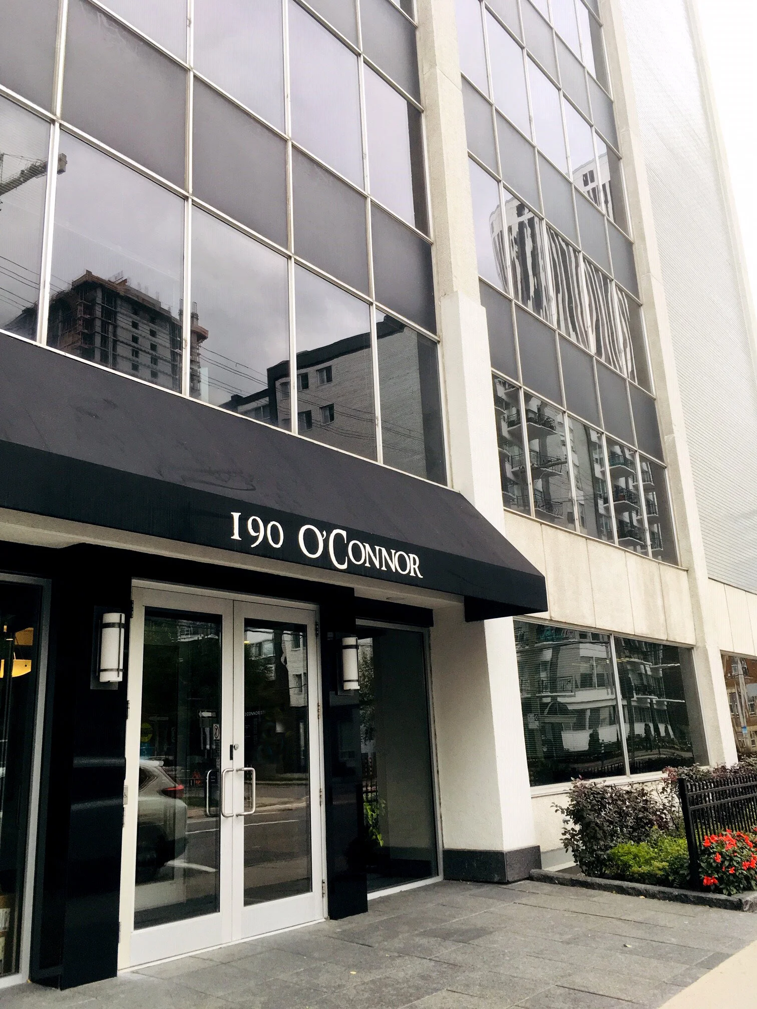
Have you heard our Big News? This spring we announced CSV is on the move! After 15 years, we’re excited to be moving downtown to 190 O’Connor Street! Although we’ll miss the eclectic Hintonburg neighbourhood, we’ve outgrown our space. So, after an extensive search, with the help of Cresa Ottawa, we found our future home, a location with great walkability (Walk Score of 100!), surrounded by bike paths and only a few blocks from the transitway and future light-rail station (Transit Score of 100!).
We’re going to take this opportunity to update and modernize our workspace to better reflect our core values, vision and mission. Our goal for this (and all) projects is to provide a sustainable, accessible space through meaningful Architectural design and collaborative discussion. As with each of our projects, there are 3 key elements to our service approach, Listen, Design and Deliver. So here’s how we Listened to staff.
Engage, listen, and engage some more. Before we started our search, we wanted to know what was important to our team. Was it a bright space with a lot of windows, did there need to be a bike path or transitway close by? As you may know, staff engagement is proven to make employees happier, both at work and in their lives. One of the first processes we used to engage our team was a survey.
Our survey results
Take a look at our survey results above, the larger the square, the higher the priority of each item. These results guided the decision making to find the right location.
Once the search ended, there was an all-staff meeting to announce the move. Although the team was happy with the proposed new location, like every new place, there’s always a compromise. The new space met most of the requirements, including all the top six. Among the many upsides for the team, natural light, greater accessibility to bike lanes, increased walkability, and as Sam Badach stated, “Free yoga on Parliament Hill!”
The Dot Approach
The next step was getting staff input for the future office design, so we engaged everyone again. This time we took a green and red dot approach and got feedback on a variety of design styles and features. Green for a design GO and red for a design NO! If the dot was placed on the edge of a photo that meant the whole picture was a go or no go. If a dot was put on a specific item, same thing.
After the dot finale, Kristi Castilloux and Darryl Hood led us through the next stage – what do all these dots mean? What we liked, loved, a maybe or a never, was discussed. And we made sure the whole team was involved, Jessie Smith skyped in from the Toronto airport and Camille Lewis skyped in all the way from Trinidad. Everybody’s voice was heard, and it turns out the listen approach is pretty fun!
To be continued
Stay tuned as we continue our office move journey with a feature on the next stage - Design! You may think the design process would be easy for us, but with a room full of designers, this could be the hardest one.


